
CSU Northridge
Health Administration
Program
For this project I worked with a team at IntersectLA to re-vamp the branding for this program and to help them expand their outreach, mainly through the use of Social Media. We designed 2 separate styles for their Instagram posts and helped them kickstart their page by creating and uploading posts for them for a few months.
Role
Brand-Identity
Social Media
Advertising
Challenges
The biggest challenge tackled during this project was the act of trying to develop a unique style for the Health Administration while having to follow the CSU Northridge's brand guidelines.

Process & Inspiration
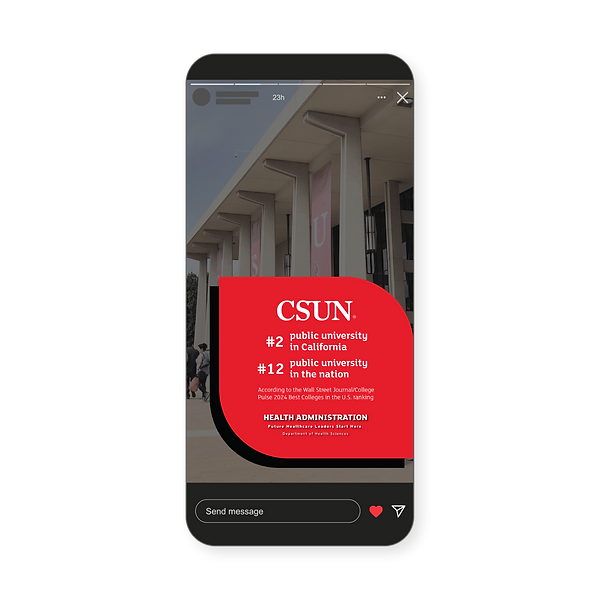
Two different but similar styles were created for this brand. One for Bachelor and one for Master. The styles of this brand were inspired by square and rectangular shapes with one, or two opposite rounded corners. These shapes are in the CSUN brand primary colors (red, black, and white) and are arranged with a combination of photographic elements.
Visual Treatments
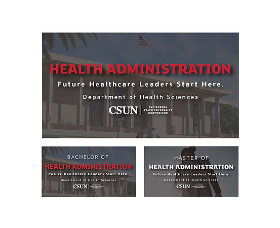
There is a primary logo to represent the program as a whole and two sub logos for each of the departments. One for each their Bachelor and Master degree programs.
At CSUN logos created for programs and departments under the CSUN brand are called visual treatments.
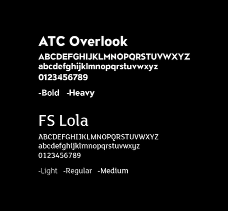
Typography
Both typefaces used are a part of the CSUN branding.
Colors
The colors used for this brand are also a part of the CSUN branding. But There were two separate overlays created for images used with the Health Administration program’s visual treatments.


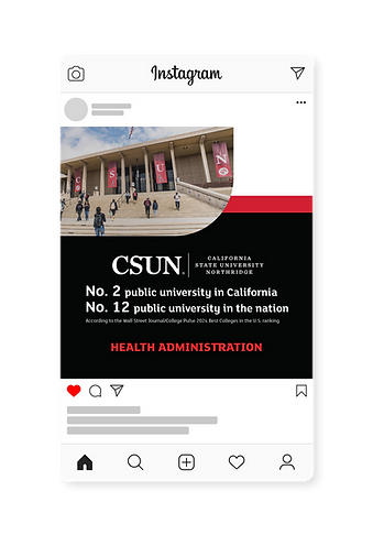
Bachelor Style
This style consists of white backgrounds and large black and red shapes. This style is also used as the default style for general posts on their pages. Our team collaborated with the Health Administration team to create a style based on the CSUN branding and the ideals and styles of their brand.

Master Style
This style consists of red backgrounds with smaller black and white shapes. This style was created to look similar to the other style but have noticeable differences so that students can discern which posts have the information they need. I helped design this style specifically.


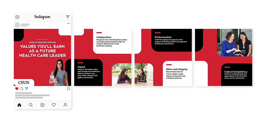


Highlight Icons
These are two different sets of highlight icons that were drafted. The first set (top row) is more image based, while the second set (bottom row) used some of the shapes and colors from the style we created to tie it into the posts on the page.

Printed Deliverables
The original style was developed for social media only. So, when coming back to the project to create these deliverables for the client it was difficult to figure out how to translate it to fit other formats.


