Zestea Iced Tea
This brand was created to offer people a good tasting drink that does not have all of the damaging, unnatural ingredients, like most other beverages on the market in America today. It also aims to help the planet where it can by minimizing the companies own impact on the planet while making and packaging its products.
Role
Brand-Identity
Packaging
Social Media
Challenges
The challenge with this project was creating a brand identity that stood out amongst similar brands, but still fit the industry and brand vision. To overcome this I not only referenced similar iced tea brands, but also canned beverage brands with similar visions and messages.

Inspirations
There were many brands that were used as references for the design of Zestea. Many were chosen because of their use of color, contrast, and use of imagery. While others, were used to inspire the brands messages about healthier alternatives that are still enjoyable and have a great taste!

Logo Sketches
Ideas referenced similar brands, but worked on trying to bring out a unique side that only Zestea has.


Final Logos
A flower was chosen because of it's ability to showcase a multitude of colors and its relation to tea. Because of the complexity of the logo a white border was given, so that it can be used on a wider array of backgrounds.


Color Palette
This color palette was chosen based off of the colors of fruits, so that they can be used on the cans to help differentiate flavors.
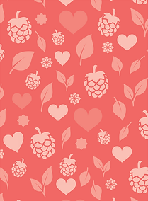


Patterns
The patterns for this brand were created to be used on packaging. The colors and shapes in each pattern are chosen and created to reference the flavor of the product it is being used on.

Typography
Bely Display was the type chosen as the header type for this brand because the shapes in the letters resemble the petals in the logo.